Designing the Calvin Jager story was definitely a challenge. I was dealing with 2000 words so one big problem I faced was trying not to make a page seem "too texty". However, this was a fun package to tackle because I could use many courtesy photos that told other aspects of the story. I eventually ended up winning honorable mention at the 2015 MIPA awards ceremony for my story package.
|
|
|
This was a fairly easy page to make, the reason I chose this as one of my top three was because of how clean it turned out. I executed it quickly and included an ALT box. The largest problem I dealt with was the amount of text. I knew I couldn't cut huge chunks out and I also couldn't make it a two page package. After a lot of playing around with the size of the picture and summary deck, I was able to fit the whole story in three columns. I added a QR code to make this page interactive.
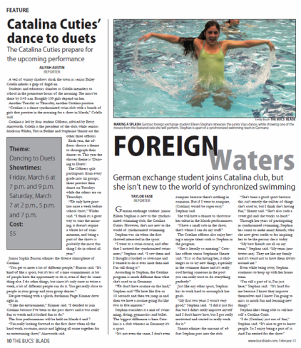
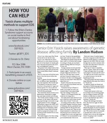
I really liked doing this page because this was the first time that I took a chance with a page design. I had a main story but also a side bar, and I got creative with the headline. I thought this page looked really clean and I'm proud of how this turned out. The only thing I might change is Taylor Fase's byline because I prefer the look of a magazine byline where it's included in the summary deck. I liked adding a rule line on the page because it split up the two stories. I also liked adding a gray box for fast facts. It's an easy way for readers to get the information they need.
